- supergoods
- Posts
- The rebrand shaking up a stale category
The rebrand shaking up a stale category
How Two Dudes are bringing energy to mens skincare
Brent Vrdoljak
November 27, 2025
I jumped on a call with the founders of Two Dudes, Tomas Tappin and Michael McRae, right between them juggling press interviews after breaking Movember’s all-time fundraising record.
They smashed it. Over $100K raised and counting. They’re even getting one of those giant novelty cheques and running a warehouse party called “Mochella”.
They didn’t lead with this as a brag, but they mentioned it because it explains everything about where Two Dudes is going.
Purpose isn’t a cosmetic layer for them, it’s their operating model.
And it’s the same force that pushed them into a full rebrand.
The guys were an open book (even on the commercial side, like the cost of rebranding🤑) and shared a behind-the-scenes look at the whole process. Let’s go.

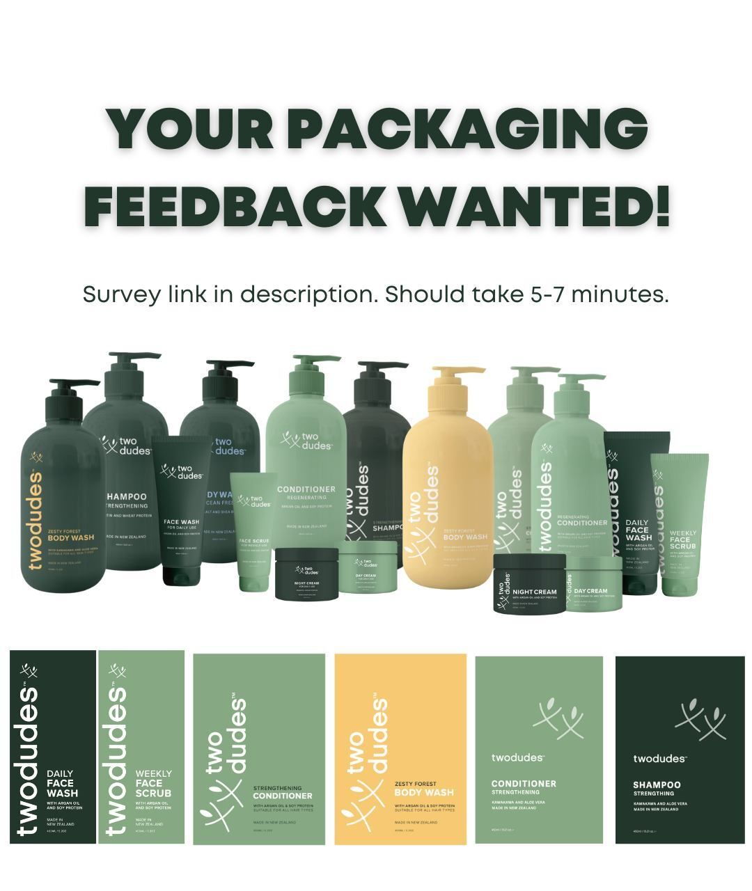
This edition of supergoods is proudly brought to you by Stickybeak

Consumer testing masterclass for FMCG brands.
Stop guessing. Start testing.
Want to test your packaging or branding before you bet the farm?
Before you commit to design-costs, supplier MOQs or shelf space — get early consumer feedback.
Stickybeak’s one-hour masterclass “Launching with confidence” shows exactly how to run rapid, low-cost tests on packaging, copy, variants, positioning or entire SKUs.
Whether you’re launching a new product or reworking your brand identity, this kind of testing gives you real-world insight, fast.
Stickybeak is my personal go-to for pack tests, so don’t miss this!
The problem with mens grooming
Here’s the uncomfortable truth about men’s grooming in Australia and New Zealand:
It’s not a men’s category.
It’s women’s brands wearing men’s colours.
Dove Men. Rexona Men. Nivea Men. Garnier Men.
Pick any brand and it’s all the same formula:
Feminine masterbrand run by big co’s
↓
Painted navy
↓
Made “for men”
Voila.
As Tomas put it:
“It’s not that men won’t buy skincare. It’s that the category was never built for them in the first place.”
And that’s the big industry blind spot:
In North America, the category exploded because of men-first brands like Harry’s and Dr. Squatch
In AU/NZ, the category was waiting for that spark.
This is the opportunity Two Dudes is chasing:
bringing a built-for-men brand into a category dominated by repackaged women’s brands.
Tie that into another invisible barrier that was holding the category back: Self-care and skincare both live in the same psychological space as “men taking care of themselves,” and men aren’t encouraged to do that.

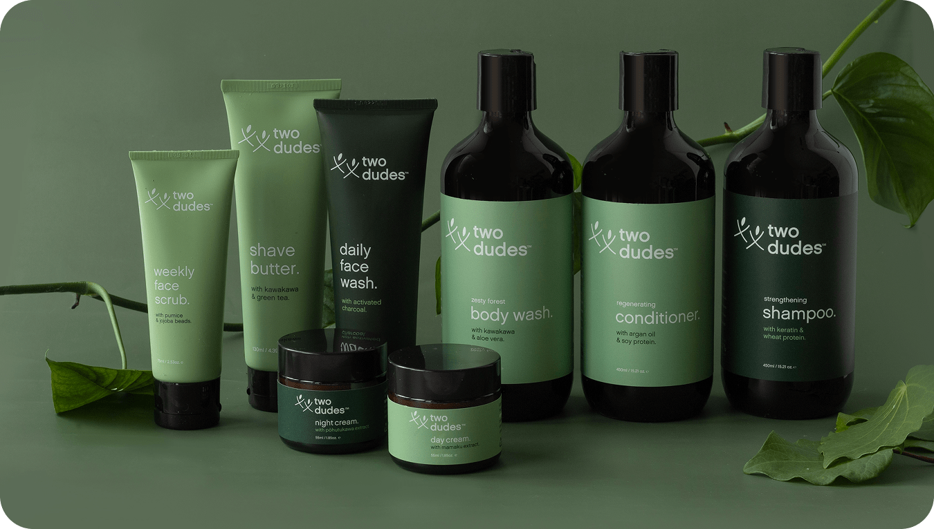
The Two Dudes rebranded in all it’s glory
When scrappy stops working
Two Dudes began the way many founder-led brands do: with heart, hustle and a visual identity assembled from whatever resources were available at the time. The logo was created by a friend of a girlfriend. The brand colours - two shades of green, one light and one dark, were chosen simply because they felt “natural.” Their creams came in glass jars, not for aesthetic reasons, but because the minimum order quantities were manageable. Everything was designed for a website, because at launch the business lived almost entirely online.
V1 - the original branding
It worked well enough in the early days. In fact, one of the more amusing footnotes from that era came when a Chinese friend pointed out that their improvised stick-and-leaf logo roughly translated to “righteousness among brotherhood.” They couldn’t script a more serendipitous meaning if they tried.
But the charm of early-stage branding only stretches so far. When they hit twelve SKUs instead of two, the cracks showed quickly. The colour system that once felt clean now looked disjointed. The jars that once signalled “premium” became fragile liabilities. And the minimal, quiet design fell flat on a retail shelf, where a pack gets two seconds to communicate, not twenty scrolls of supportive website copy.
That’s when they realised a rebrand was a requirement.
The DIY rebrand that didn’t land
Tomas and Michael started the process like we all do, their own mockups and havin’ a crack themselves. They had a group of VIP customers provide feedback and ticked off functional problems one by one.
But the interpretation was too literal. Every piece of feedback became a direct adjustment to the pack. The redesign was tidy, practical… and creatively lifeless.
“It became a flowchart of feedback - functional, but not bold”
 The DIY attempt | The result was a design that looks kinda the same, except worse. This is where many founder brands stall. Insights are essential, but customers can only articulate friction, they can’t design the system that removes it. Two Dudes eventually recognised they weren’t reimagining the brand; they were editing around the edges. That’s when they brought in outside help. |
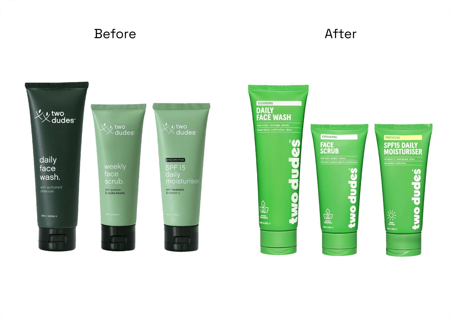
The brief: bold & cohesive
These two words guided their process. Two Dudes brought in design agency Milk to execute the rebrand.
Bold, because men’s grooming in ANZ had gone visually stale.
Cohesive, because their old system had become a patchwork of colours and pack formats.
Those principles drove the major changes. They dropped the generic “men’s aisle” cues and committed to a single, distinctive green that became their anchor. They flipped the logo vertically to instantly break shelf patterns. And they built navigation through colour tabs, borrowing from adjacent categories, because men often shop by “the blue one” logic.
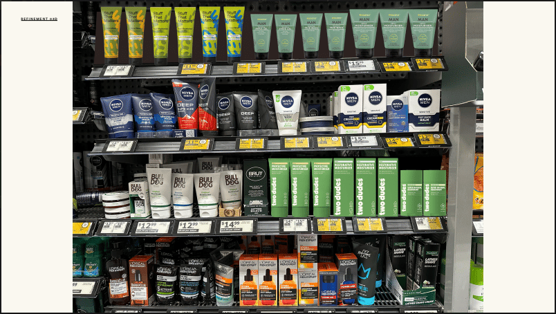
Critical to the process: mockups in the competitive environment
For personality, they explored everything from rugged hyper-masculinity to soft wellness minimalism, eventually landing on something modern, energetic and centred. It’s masculine without theatrics and warm without drifting into pastel wellness clichés.
“There’s category conventions that you bend, and category conventions that you don’t break.”
The cost and the payoff
The rebrand cost them a meaningful five-figure sum - enough to feel painful and potentially risky for an early stage business.
But the return didn’t come as an overnight sales spike. Instead, it showed up in long-term unlocks: stronger retailer confidence, international interest, supplier consolidation and packaging efficiencies.
The guys were convinced they’d seen an ROI already in simply making the packaging COGS more efficient through this process, before calculating the commercial impact of the distribution gains it built.
Refinement over reinvention.
The process didn’t reinvent Two Dudes, it clarified them. Clean, effective skincare made for men. A brand designed for how men actually shop. A mission tied to real men’s health outcomes, not tokenism.
They aren’t trying to out-blue the aisle or imitate softened-down women’s brands. They’re building a men-first brand for a category that has always been an afterthought. And the rebrand finally makes that ambition impossible to miss.
What did you think of today's story?Click to vote, it helps us improve. |
Reply