- supergoods
- Posts
- Cigarette codes are making a comeback in CPG
Cigarette codes are making a comeback in CPG
Niche trend or the next wave of culture?
Brent Vrdoljak
January 29, 2026
Cigarettes are now more regulated than ever.
Yet between popular CPG media company Snaxshot glamourising cigarettes, Charli XCX’s new video with Kylie Jenner smoking darts and a flood of black market smokes in Australia, it feels like cigarette culture is slowly creeping back into the mainstream.
Today’s episode looks at one genuinely shocking example from history and a handful of new launches that suggest the aesthetic never really left.
This is part four in our ongoing Vices series, part three on negativity is our fave.

This edition of supergoods is brought to you by Mind Control - the branding and packaging studio behind this newsletter.

Today’s your day. You’re off to great places. You’re off and away.
You have brains in your head.
You have feet in your shoes.
You can steer yourself
in any direction you choose.
You're on your own. And you know what you know.
And YOU are the guy who'll decide where to go.
Dr. Seuss - Oh, The Places You’ll Go.
We decided to use this ad space to share a favourite poem instead. Enjoy.
Yes, this is real. The era of cigarette cosplay.

Popular Aussie confectionery manufacturer Fyna Foods. Image source: Fyna Foods
Anyone who grew up in Australia will recognise these instantly.
Originally launched in the 1940s and eventually rebranded to Fads in the 1990s, these cigarette-shaped candy sticks hit you with a jolt of nostalgia - followed quickly by a wtf moment.
The semiotics weren’t subtle. A cigarette-style pack format, a name that was literal slang for smokes and a red tip designed to resemble a lit cigarette.
This wasn’t an accident. These lollies were deliberately designed to mimic cigarettes and squarely targeted at children - softened only by a cute, friendly illustration doing the work of plausible deniability.
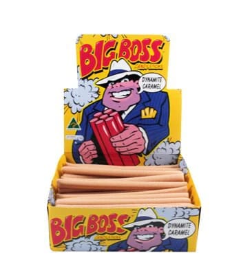 | They sat in milk bars alongside other questionably positioned items like Big Boss (officially marketed as “dynamite sticks”, but very obviously borrowing cigar energy). In the ’80s, it was normal for kids to role-play their parents’ bad habits - and confectionery brands were more than happy to help. You can even buy hand painted artwork of the old “Fags” pack designs today. |
From overt to subtle: the shift
A couple of years ago, LA-based creative studio Mouthwash Studio designed and launched their own cigarette case.
It wasn’t ironic or just nostalgia, it was a real release and treated like a genuine design object.
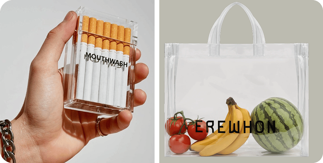
Mouthwash Studio cigarette box and Erewhon bags.
Stripped back, transparent and styled more like a luxury accessory than a vice, it sat comfortably alongside the see-through bags popularised by luxury grocer Erewhon - making the product the hero through restraint, not branding.
Mouthwash are known for culture-shaping creative work, not novelty merch. And while this wasn’t a CPG launch, it felt like an early signal: cigarette aesthetics reframed, sanitised, and made visually desirable again. Perhaps this design project laid the foundations for what has come?
Since then, we’ve started seeing the same codes show up elsewhere. The overt cigarette cosplay of the past is gone. But it’s coming back in new formats and new brands.
Here are a few recent launches borrowing from the same playbook.
Sleep or die: join the strip club
Canadian founder Lauren Sudeyko just pressed go on her new brand, Sleep or Die. It’s basically a sleep supplement in a tab format, packaged up in a pretty cigarette box. And damn does this packaging sing. The graphics, colours and type selection are all bang on - wrapped up in a voice that gives the brand grit and edge.
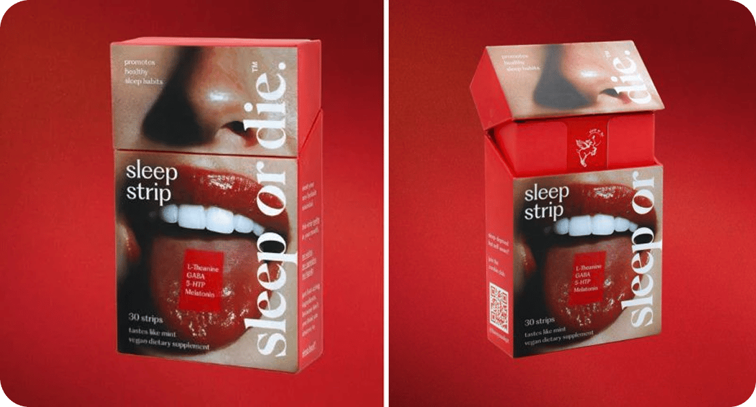
Lauren is overt about the cigarette box and she’s dominating Linkedin at the moment, turning that brand voice into her own and dialling up the vice nature of the identity to build her personal brand alongside the Sleep or Die brand.
The packaging format of a cigarette box is used to give the brand an extra touch of cool factor. It’s an intentional nod to a bad habit, creating this yin & yang element of a health supplement that feels a bit heavy metal.
They’re locking in that provocative edge to give personality to a boring category, aiming to build desire and hype around the brand. I reckon this is one to watch. Go buy it now.
A swing for the fences - Gigantic redesign
Candy bar brand Gigantic recently dropped a major pivot in design and format.
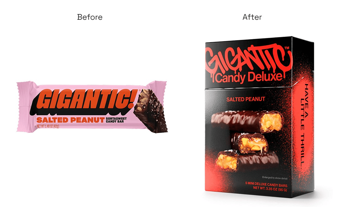
I wrote about the rebrand here, touching on the design shift from dopamine to doom that I think we’re going to continue to see through 2026.
 | And with that rougher, edgier branding comes a new packaging format. The mini candy bars are packaged in a cigarette-inspired box. Even their website leans into it - dark palettes, blunt language, minimal optimism. The cigarette box format isn’t doing the selling on its own, but it reinforces the broader shift: away from bright, playful confectionery and toward something harder, colder, more adult. It’s not literal cigarette cosplay. |
The box shape does just enough work to signal attitude, not habit. Rebellion, not addiction. A shortcut to edge in a category that’s historically leaned cheerful, colourful, and disposable.
So what’s the go here?
This isn’t about smoking making a comeback.
It’s about designers and founders reaching back to one of the strongest visual languages ever created, one that signalled adulthood, consequence, control, and cultural defiance - and repurposing it for new products.
The cultural codes of cigarettes have simply been unbundled:
the box
the proportions
the blunt tone
the anti-wellness posture
…and reattached to categories that want instant credibility, grit, or cultural weight.
From kids’ lollies in the ’40s and ’80s, to luxury accessories, sleep supplements, and candy bars - the pattern is consistent. The product changes. The codes persist.
The new brands here aren’t endorsing smoking. They’re just borrowing the meaning.
What did you think of today's story?Click to vote, it helps us improve. |
Reply