- supergoods
- Posts
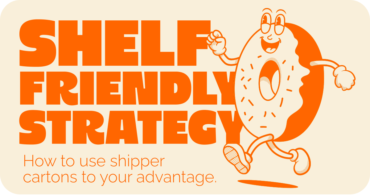
- Six lessons for shelf impact
Six lessons for shelf impact
How to leverage the forgotten box.
Brent Vrdoljak
November 13, 2025
“This is one area marketing can absolutely NOT touch. It’s purely operational.”
That’s what a Managing Director at a major FMCG business told me years ago, referring to updating our products shipper cartons.
Back then, I thought it was a bit odd but continued living my life.
Today, I think it’s completely insane.
Because this one ‘operational box’ is one of the most overlooked, influence-heavy, commercially impactful parts of the shelf presence game. And marketers ignore it at their own expense.
Let’s break it down.
This edition of supergoods is brought to you by Mind Control - the branding and packaging studio behind this newsletter.

Don’t forget the bigger picture.
Shippers, trays, cartons, sleeves - every touchpoint counts.
Most agencies don’t think about them.
We do.
The overlooked and annoying part of packaging
Shippers are a pain in the arse. They exist because they have to. They’re literally how your product survives a pallet journey from warehouse to stores without getting annihilated. And now retailers want everything in “Shelf Friendly Packaging” or “SRT” or whatever new three-letter acronym they invent next… which basically means: a heavy-duty carton that a store stacker can rip the top off and instantly turn into a display tray.
The problem is that every part of this brief works against you. The board has to be strong enough to ship on a pallet (so it tears terribly and looks rough). It has to be cheap enough not to blow out your COGS (think 1 colour print on brown board). And worst of all, it’s almost never considered early in the design process - meaning it often covers half your beautiful primary pack and really ruins your day.
The love/hate relationship
I had to learn these lessons the hard way. A few times in my early days, we simply didn’t think about the shipper carton until it was at shelf. That’s a major fuck up - most the time it ended up covering important information on pack and ruined our display.
Here are the things I wish I knew earlier
Lesson one: if it covers it, say it again
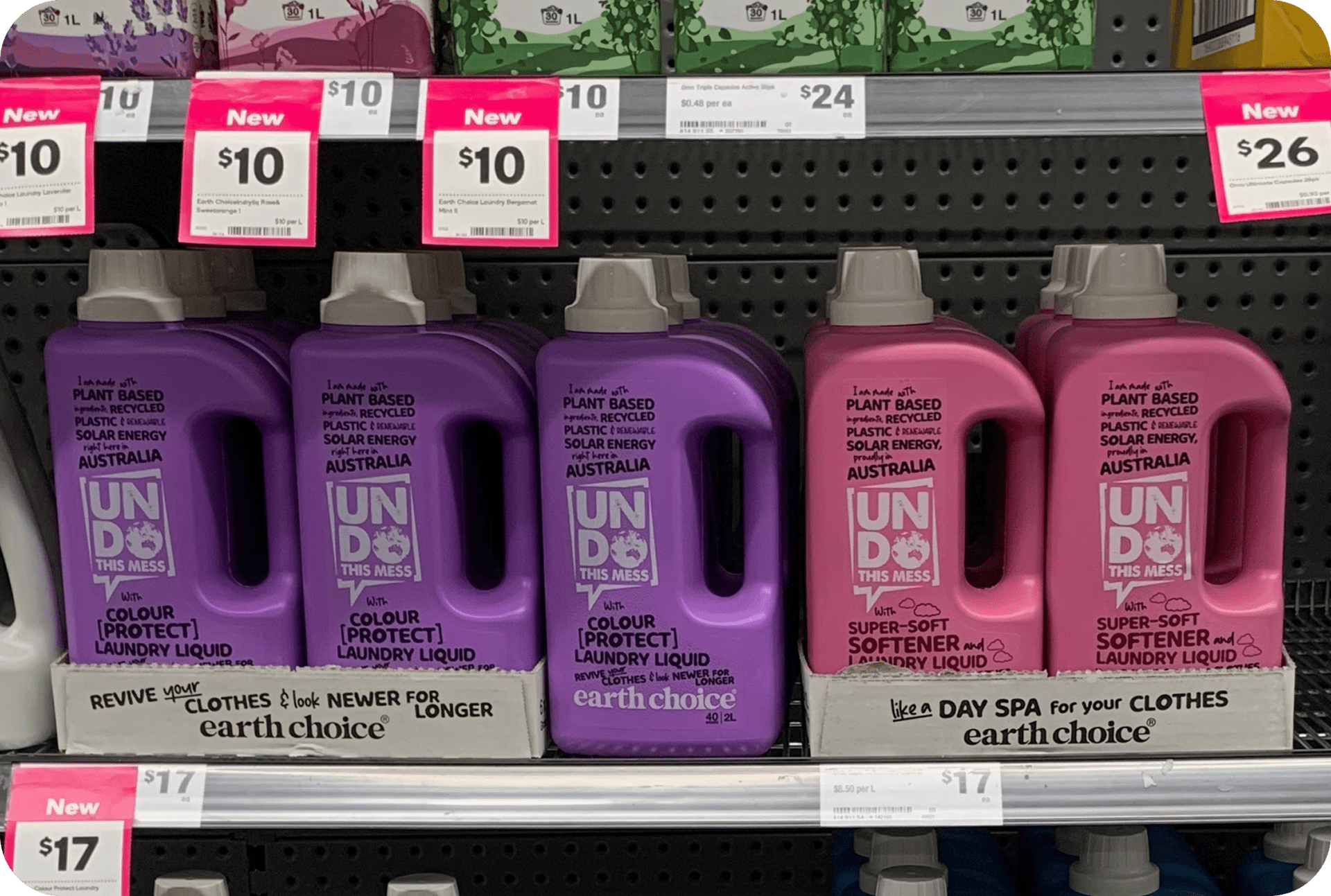
Shipper cartons designed to repeat covered messaging.
We spent so long crafting these fun lines of copy, there is no way I’m letting a dumb cardboard box get in the way. Simply repeating any information that’s covered should be priority number one. You can avoid this entirely with clever design of your primary pack, but if you need to use every square inch, use it wisely.
Lesson two: iterate and align your messaging
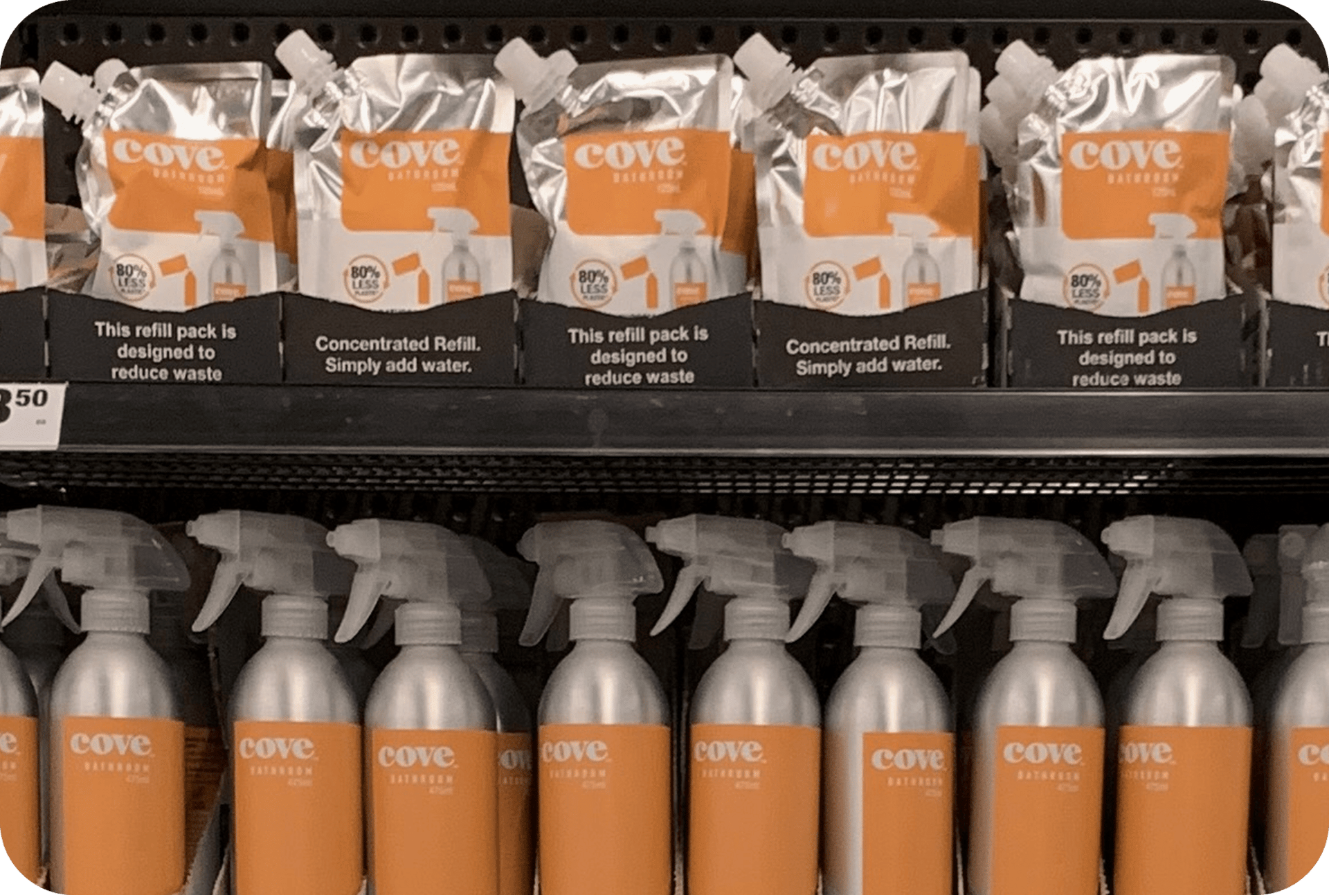
The shift from “benefit” to “what is it”
It’s often a lot easier to whack a new message on a shipper carton than it is to redesign your pack entirely. When we launched these refills, we put out a message about the benefit “reducing waste” but completely overlooked the fact that no one knows what the hell a refill is. With insane MOQ’s on our pouches, we couldn’t update our artwork quickly but we subbed out messaging on the carton to help close the gap.
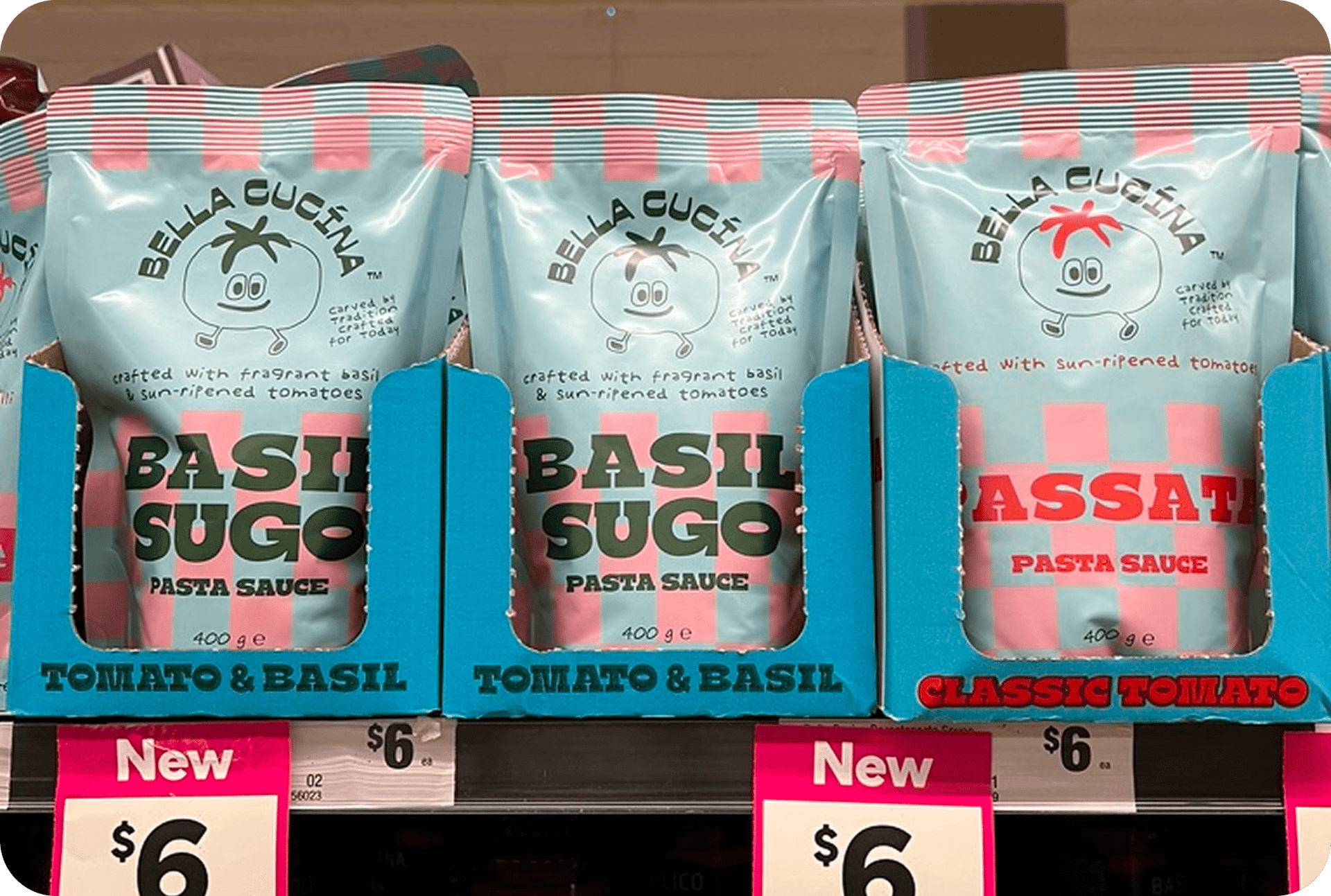
Flavour cues to guide the audience
I spoke to the founders of Bella Cucina when they were early in their packaging development. I was embarrassed to admit I didn’t know what “arrabbiata” meant and assumed that a good chunk of Aussies wouldn’t either. Even though the flavour profiles of each sauce were explained in small print on pack, the founders decided to reiterate it simply and boldly on the shipper carton.
Lesson four: add contrast for shelf impact

Contrast and brand blocking
I spotted this in Costco because it immediately stood out. The primary packaging design is a puddle of beige, but the shipper carton provides high contrast and a killer brand block.
Lesson five: overcome barriers

If you’re new to retail but have traction elsewhere, flaunt it. I came across this design by Billie and got the strategy immediately - they were established online, so they used this shelf presence to highlight their social proof. Clever.
Lesson six: invest like the best

I think Zuru are the best modern CPG company on the planet. If you want to get good at this game, study everything they do. This is a masterclass example of investing in shelf presence beyond the standard shipper carton. It’s leveraging every touchpoint, making sure to capture attention and communicate their range to cold audiences wandering the aisle.
Sure, not every brand can afford this, but it’s fun to have goals.
They aren’t glamorous, but it’s worth your attention.
Save this email for the next time you’re looking for inspiration. Shipper cartons are one of the cheapest, highest-leverage tools you have for shelf presence. Ignore them and you’re leaving money on the table. Nail them and you get a free kick every time someone walks past.
What do you think?
If you enjoyed this, share it with a co-worker or consider subscribing if you aren’t already.
What did you think of today's story?Click to vote, it helps us improve. |
Reply