- supergoods
- Posts
- Surreal gets real: the strategy behind a challenger's rebrand
Surreal gets real: the strategy behind a challenger's rebrand
Cereal just got serious.
The goal of this newsletter has never been to become well known.
It’s to be known well.
A small circle of people who truly get what we’re into is worth more than millions who don’t.
Supergoods is a magnet.
It draws in the like-minded - the ones who geek out on branding, consumer goods, and the strategy behind what ends up on shelf.
And the best part of that traction is when people start sending you things they know will hit.
Today’s story is one of those - a rebrand passed our way by strangers, clients, and friends alike. It’s been impossible to ignore in our corner of the internet.
And it’s a beauty. Because it’s where cool aesthetics branding has been slapped in the face by reality and forced to comply with the rules of effectiveness.
Let’s dive in.

This edition of supergoods is brought to you by Mind Control - the branding and packaging studio behind this newsletter.

Most brands shouldn’t “rebrand”.
We often talk ourselves out of work because strategically, it’s not the right thing to do.
If you’re toying with a rebrand and want an expert opinion, let’s have a chat. We’ll give you our harsh take with zero bullshit.
Our brains have evolved to adapt to the supermarket
There are only a few certainties in life: birth, death, and the cold, harsh reality of the supermarket shelf.
The grocery store is chaos. Harsh lighting, endless noise and ten thousand brands screaming for your attention.
But our lizard brains have evolved to handle the madness.
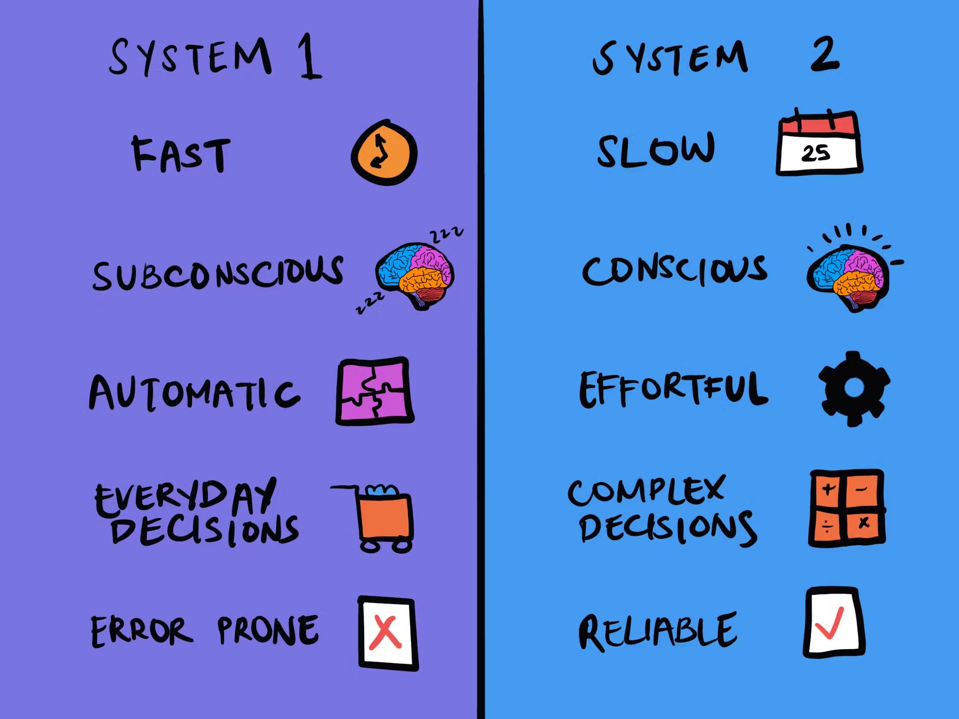
We rely on System 1 thinking - intuitive, rapid-fire shortcuts built through repetition.
These patterns are what help us make sense of the shelf without losing our minds.
Contrast that with System 2 thinking, it’s slow, conscious and requires effort..
The best example is simple maths.
You know 2+2 = 4 without thinking (System 1).
But if I ask you 2+2 × 6+4, you can figure out the answer, it just takes a minute (System 2).

Source: The Decision Lab.
Mini Challenge: See the theory in action.
If the System 1 idea in the grocery store sounds abstract, try this:
Pick a category you don’t usually shop. Let’s say confectionery.
Head to the supermarket at peak hour (Thursday 4–6pm is perfect).
Watch people.
What do they pick up first?
How long do they look?
Do they flip packs? Compare? Or just grab and go?
Once you spot a pattern - intercept. Ask why they chose that product.
They might tell you to fuck off (it happens). But after a while, someone will answer, and they most likely can’t even explain their purchase. They were operating in System 1.
This exercise is a real world example that highlights the role packaging plays in decision-making - and why the best designs communicate in a glance.
The cereal case study
Surreal is a British cereal brand founded in 2020 by former advertising creatives - two guys who were sick of “grown-up” breakfasts that either tasted like cardboard or were loaded with sugar.
Their idea was simple: make cereal fun again, but high in protein, low in sugar, and built for adults who still crave a bowl of something nostalgic.
From the start, Surreal behaved nothing like a traditional FMCG brand.
They skipped the TVCs and supermarket coupons. Instead, they built their audience online - one outrageous ad at a time.
Their irreverent tone, deadpan humour and self-aware posts made them a cult favourite across social feeds.
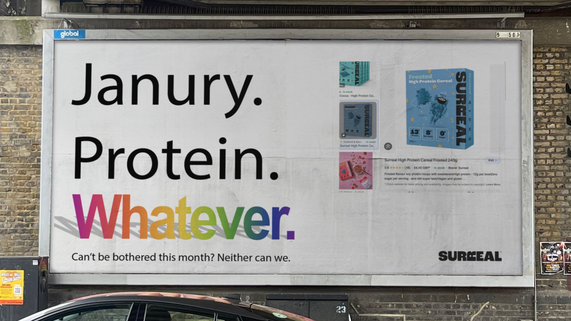
Not many CPG brands can say they’ve gone viral by trolling themselves and posting sometimes real and sometimes fake billboards with the most ridiculous ad creatives you can imagine.
That’s Surreal.

And their packaging matched the energy - loud blocks of colour, bold typography, no food photography. It felt more like a DTC fashion brand than breakfast food.
But what gets you noticed online doesn’t always work on shelf.
The rules of rebrand effectiveness
This week, they revealed their rebrand. A dramatic shift from DTC darling to retail reality. At a glance, it looks kinda the same (which is actually PERFECT, people need to recognise the brand still). But in detail, it’s a huge change.
Reply