- supergoods
- Posts
- Why brands succumb gravity
Why brands succumb gravity
The physics of redesigns
Brent Vrdoljak
May 14, 2026
I’ve said this before and I will say it again:
grocery brands always follow a regression to the mean.
A slow drift back to norms and the invisible rules of the game.
If you follow my content on Linkedin, you’ll know I am a little bit obsessed with brand and packaging redesigns.
To the point that over the past few years, I’ve built up a fairly unique database of rebrand analysis.
I’ve lost count, but I’d estimate I’ve studied and broken down more than 100 redesigns.
A completely nerdy, mildly lame hobby.
But it has given me a useful perspective:
There are rules to this game.
Let’s unpack them.

This edition of supergoods is brought to you by Mind Control - the branding and packaging studio behind this newsletter.

Right now we are working on brand & packaging across coffee liqueur, K-beauty, ready meals, salty snacks and a whole lot more. These are all dream projects.
But on the vision board for the year, we wanna work across confectionary, coffee, wine and hospo brands. If you or anyone you know can make this happen, there’s a special prize* for you.
Throwing it out into the world for magic to happen.
*prize is a firm handshake and eternal glory.
Before we begin
First up, let’s clarify what I mean by rules. I think Nick from Mid-Day Squares said it to me best:
There’s this tension between how you keep creativity and innovation alive and how you respect the rules of CPG. And those rules aren’t really rules - they’re tried and tested methods to sell product to consumers who are moving very fast in a grocery store. You can try to break those rules, but you may not always succeed, and you may pay for it in performance at shelf level.
You can try to fight this gravity.
But it’s a bit like pissing in the wind - it’s gonna be messy.
Rule one: A picture says a thousand words

This is probably the most common optimisation brands make as they mature in grocery.
No matter the category, origin story or ambition, if a brand plays in supermarkets long enough, it usually drifts toward clearer visualisation of the product, benefit or consumption experience.
HiSmile is a great example.
They have deep eComm roots. They’ve been flying in grocery and pharmacy. They’ve taken share from legacy oral care brands. And yet, they’ve still made the same move.
The shift from selling the tube alone to a more conventional unit box and vessel feels symbolic of their maturity as a retail brand.
But the visuals are the real tell.
Those high-impact, glossy, almost glass-like fruit renders are a perfect example of a brand sharpening its core benefit:
We’re not just toothpaste. We’re toothpaste with a shitload of flavour.
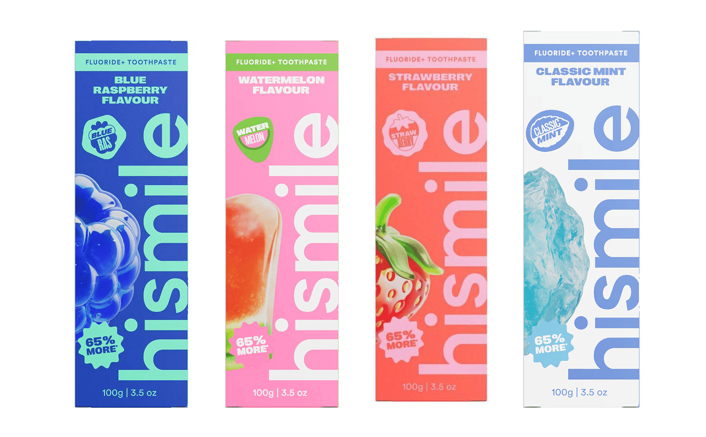
It now sits loud and proud on pack. But if you read between the lines, you can see it as almost a glaring admission: We’ve been successful so far, but the masses still don’t instantly understand what we’re about.
And that’s the point.
Shoppers don’t care about your brand as much as you do. They won’t stop, study your differences and decode your strategy. You need to make it immediately bloody obvious why they should pick you up instead of their usual purchase
Rule two: you are the Captain of the ship
In pack design, hierarchy is everything.
The order in which people read, process and understand information is largely within your control. Which means it is also your responsibility.
Brand owner, founder, creative director, agency, freelance designer — it doesn’t really matter. If you’re contributing to the pack, you need to be brutally intentional about the flow of information.
Because shoppers will typically only process a handful of elements when scanning the shelf. So you need to be ruthless about what you tell them, and in what order.
The best analogy is the tennis ball game.
If I throw you one tennis ball, you’ll catch it. Happy days.
If I throw you seven, you’ll get hit in the face and walk away mildly annoyed.
Pack design works the same way.
Typically, you’re playing with some version of:
Brand.
Product.
Flavour.
Claims.
Variant.
Benefit.
Reason to believe.
The natural instinct is to tell people everything.
Do not do that.
There is no universal hierarchy that works for every brand. The right order depends on your stage, your level of fame, the shopper’s priorities and the category dynamics around you.
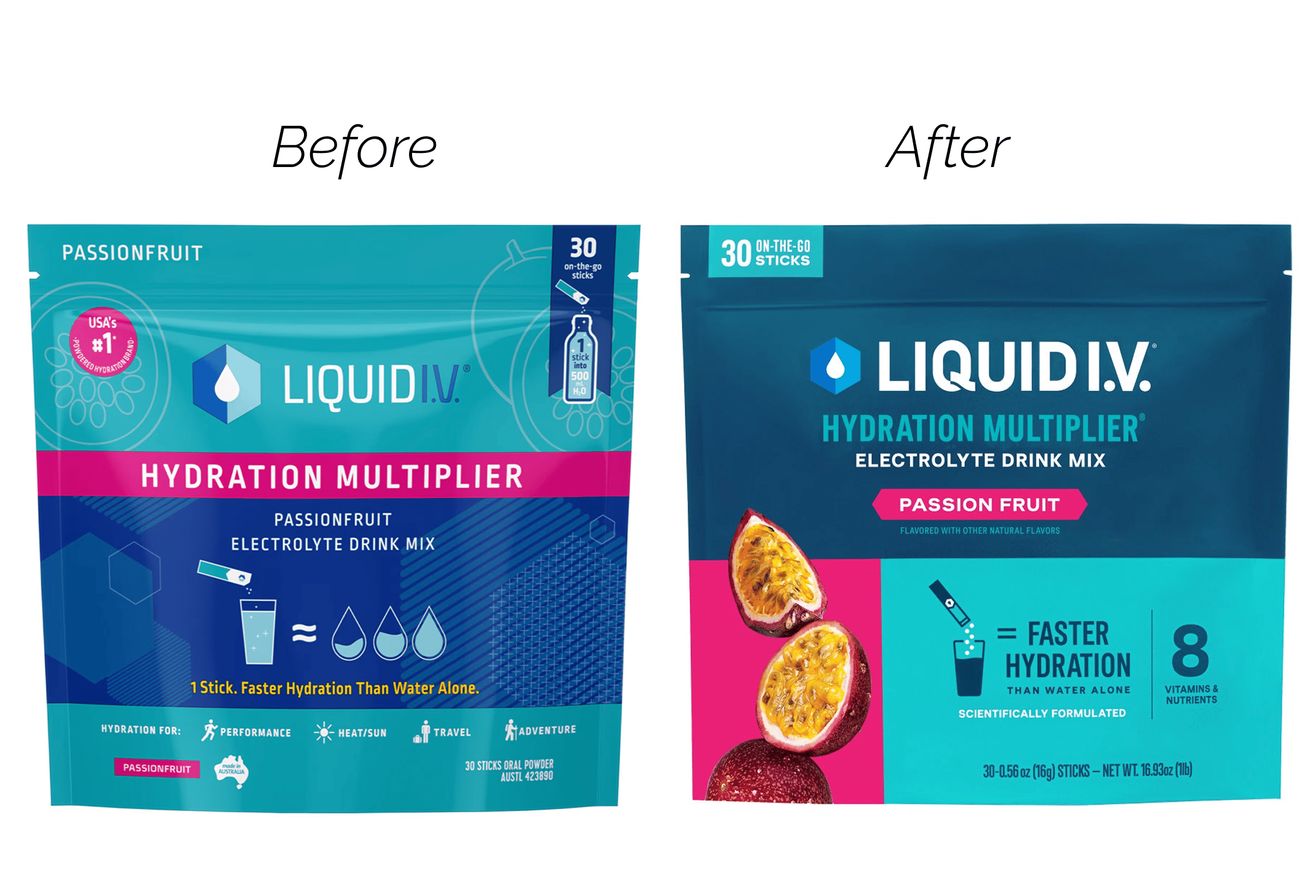
That’s why this Liquid I.V. redesign is such a useful reference point.
Not because the old pack was ugly, but because the hierarchy was broken. Too many elements were competing for attention. The brand, product descriptor, flavour, benefits and claims all fought for priority, which made the pack harder to process than it needed to be.
And on shelf, that friction is deadly.
Shoppers don’t lean in and reward complexity. They deselect it. Then they move to the next brand that makes the decision feel easier.
Rule three: creativity is your only weapon
Nailing rule one and rule two sounds simple in theory.
Until you start pushing pixels around.
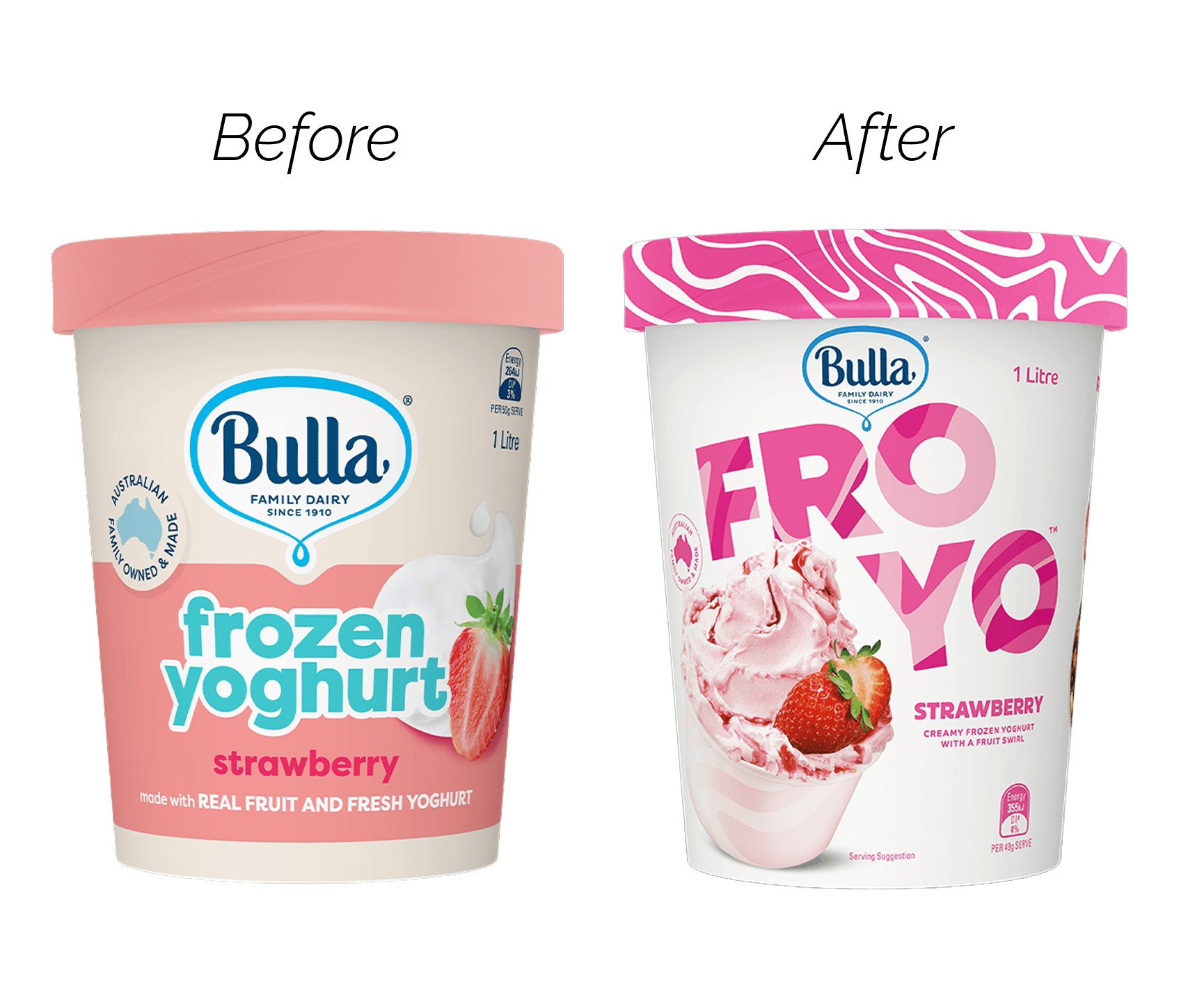
This FroYo redesign is a perfect example of using great design and creativity to bring these principles to life. Shoutout to The Thrills on this work.
You could look at the old design and argue it ticks the boxes: product visuals to illustrate taste, hierarchy to guide the shopper.
But next to the new version, it completely falls flat.
And this is the part that’s harder to explain.
The difference between “clear” and “compelling” is creativity.
The new pack doesn’t just communicate flavour better. It makes the product feel more fun, more desirable and more alive on shelf.
This bit can feel a little intangible. Almost like magic when it’s done right.
I had a conversation last night about the difference between a single freelance designer and a studio, mostly from the angle of price and why studios can be so much more expensive.
The answer is obvious:
There are simply more brains in the room.
At Mind Control, our projects can have one to three strategists and three to six designers contributing ideas, reviewing the work and pushing the standard higher.
It’s very rare that one solo person could outperform a properly directed creative group, regardless of how many chatbots they have open.
Let ‘em cook
I think the potential of creativity is what lights me up the most about this work. The rearrangement of pixels and ink can create so much value.
We’ve expanded our team recently with a few new account wins, and it is just so exciting to see how our collective minds can take this basics and transform brands to win more sales. The best is yet to come.
What did you think of today's story?Click to vote, it helps us improve. |
Reply